

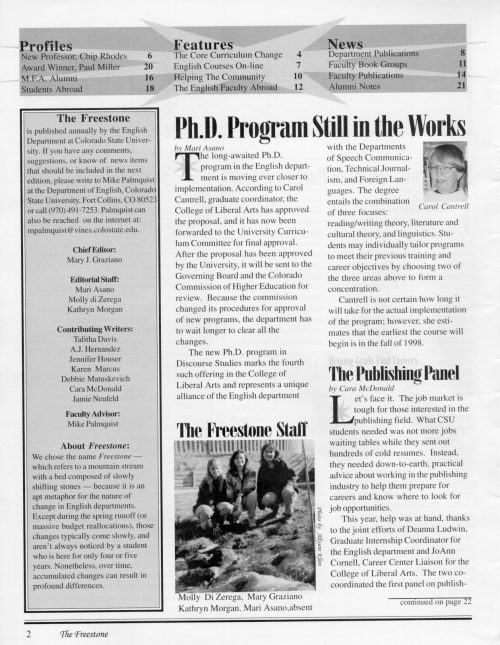
Desktop Publishing
Updated Jun 2022
Desktop publishing is the process of laying out and designing pages with your desktop computer. With software programs such as Adobe PageMaker and Quark Xpress, you can assemble anything from a one-page document to a full-length book. Understanding how the software works, however, is only the beginning, and often the easiest part of the whole process. This site is designed for the novice page designer who wants to learn the fundamentals of effective page layout. So, whether you need to design a brochure, advertisement, or an entire newsletter read on!
Who Should Read This Guide?
This guide is intended for two audiences: CSU students, and people browsing the internet for how-to advice on designing newsletters, brochures, or advertisements.
Although most of our examples come from the 1997 Freestone (the English department newsletter), the concepts they illustrate will be useful to all novice page designers.
Writer as Designer
Because good page designs organize information, capture attention, and expedite comprehension, layout can be viewed as an extension of the writing process.
Publishing software, such as Adobe PageMaker and Quark XPress, has made it possible for one person to write, edit, and design an entire publication. Without it, the cost of publishing a twenty-four-page newsletter like the Freestone would be prohibitive.
Now, companies everywhere produce in-house newsletters to communicate with employees.
Principles of Layout and Design
This section addresses the fundamental themes of page layout and design:
- Purpose and Audience
- Organizing Information
- Getting Their Attention
- Balance
- Alignment
- Repetition
- Emphasis
- Proximity
Purpose and Audience
Approach page layout the same way that you do writing; determine your audience, define your purpose, and communicate your message. When you're writing, make sure you're present information in a logical order, so do the same when you lay out the page.
Organizing Information
Photographs, pull-quotes, decks, and headlines help you tell the story. Other elements such as subheads, boxes, rules, and white space help you organize the story.
For example, if you laid out three short articles on the same page, you would use rules, white space, and headlines to show readers that the articles were separate, not related.
A good layout improves readability by arranging text and graphics in a logical order.
Every time you place a textual or graphic element on the page, you are making a rhetorical decision, and where you place that element depends on its relationship to the other pieces.
When you're writing, you organize sentences and paragraphs in a logical sequence so that readers will understand your message. You should approach layout the same way.
Just remember that page design is a flexible process. There are no hard and fast rules, just guidelines. Keep good communication with readers as your top priority, and you will make the right design choices.
Getting Their Attention
In today's media-intensive culture, people often decide that reading an ad, brochure, or newsletter is not worth their time, so even if your publication is important, it may end up in the wastebasket. An unusual design, however, can spark their interest. Even the most sophisticated readers get bored with staid designs.
Bottom line: grab their attention first, and then keep them reading.
Jan V. White, author of Editing by Design: A Guide to Effective Word-and-Picture Communication for Editors and Designers, says that readers often look through magazines from back to front (and newsletters are specialized magazines), so you should use a hook to capture people's attention.
A hook is anything that contrasts against the uniformity of the text such as a photo, graphic, masthead, or a pull-quote hanging in a column of white space. Everything from the text to the paper it's printed on affects whether or not your publication is read with interest, so be creative.
We just have one word of caution. Readability. An effective page layout improves reader comprehension, so you must balance the imaginative elements with the functional elements. In other words, a splashy graphic laid out at an unexpected angle is eye-catching, but three columns of centered text are a nuisance.
Good page design balances function with form, consistency with contrast, and places successful communication with the reader above all other considerations. Think of layout as a jigsaw puzzle. Every piece fits together to make the whole.
Balance
Balance is another word for concerns about symmetry and asymmetry. Symmetry provides stability and rest for the eye, while asymmetry creates tension and visual interest. Finding ways to create balance often depends on the piece.
In a newsletter, for instance, a horizontal rule running along the top of the page contrasts against the vertical columns of text, adding an element of asymmetry to the page.
Alignment
Unify the appearance of your publication by aligning the elements on individual pages and creating strong page-to-page alignments, as well.
In newsletters, for example, align the tops of photographs with the x-height (the top of the small case letters in a line of text) in the adjacent column, and give headlines the same alignment from page to page.
In the first example below (a flyer), the elements on the page are not aligned with each other.
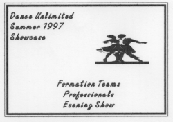
The text block in the upper left-hand corner is justified, and the other text block is centered, while the graphic element seems to hang in the middle of the page. This is messy looking.
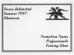
In this second example above, the look is improved because both text blocks are justified against a boundary of white space, and the graphic is aligned with the block in the upper left-hand corner.
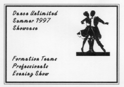
In this third example, the look is further improved because the graphic is aligned with both the upper and lower text blocks.
Alignment ties all the elements on a page together and unifies the publication as a whole.
Repetition
Repetition of key elements (logo, box, rules, graphics etc.,) from page to page unifies the appearance of your publication.
In a newsletter, for example, you might place the company logo at the bottom of every page, or in a brochure you might repeat a small graphic element in a variety of places. We used star shapes as backgrounds for drop caps and pull-quotes on every page of the 1997 Freestone.
However, repetition without variety becomes monotonous, so use a photo or graphic to add interest to a page. The repetitive elements create visual coherence, while the occasional incongruous element creates contrast, the visual spice.
Emphasis
Use a hook to get the reader's attention. Anything from an interesting photo or graphic to a pull-quote isolated in a column of white space can catch the reader's eye.
When we communicate orally, we emphasize ideas by changing our tone of voice. In layout, a hook serves the same purpose. It tells the reader that something is important. Emphasis can be created in different ways. Text in a large point size, for example, shouts at the reader: "I'm important! Read me now."
You're only limited by your imagination.
Proximity
Place related information in proximity, and separate unrelated information with white space, rules, and borders.
In the flyer below, the first two blocks of information both have subheadings in 18-point Helvetica, making them of equal importance, but the white space between the blocks makes it obvious that they're unrelated.
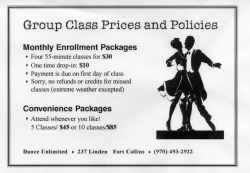
Bullet items appear beneath each subheading, calling attention to the individual points, and their proximity shows that they're closely related. Finally, at the bottom of the flyer, the company name is placed in proximity to the address and phone number because those are all related elements.
By first grouping related information and then separating the groups with white space, rules, or borders, you organize information and make the reader's job easier.
Elements of Layout
Layout involves a range of techniques.
- The Style Sheet
- Grids: Organizing Your Layout
- Layout Tools
The Style Sheet
The style sheet is one of the best features of electronic publishing. Attributes such as typeface, type size, and leading can be predefined, making the job of formatting your project quick and easy.
Once styles are defined, you can instantly apply different attributes to a single word, several paragraphs, or an entire publication. Defining your style sheet in advance saves you time and effort later.
The style sheet has many advantages. If, for example, the body text of your newsletter is laid out in Helvetica, you can change it to Times Roman with a single mouse click. If you hadn't originally tagged the body text as Helvetica, you would have to change each text block individually.
However, before you begin defining styles for your publication, you should do the following:
- Specify the page dimensions.
- Assign the number of pages.
- Set the width of the margins.
In PageMaker this is done through the Document Set-up window. First, open the File pull-down menu and select New, which will open Document Set-up. Set your document parameters. Having completed this task, you're ready to define styles for your publication. In PageMaker 6.5, Define Styles is located on the Type pull-down menu.
For the 1997 Freestone, we made our typeface and point size selections for headlines, captions, bylines, body text, and photo credits at the outset. Click on the link below to see the styles we selected.
I strongly recommend that you first spend time learning how to define styles in your publishing program, and then decide how you want your publication to look. What typeface and point size will you use for headings and subheads? Will you use 10-point Times Roman for the body text? Will you use a different typeface for pull-quotes?
Most importantly, predefined styles will ensure that your publication has a consistent look throughout.
Grids: Organizing Your Layout
Nonprinting vertical and horizontal blue lines form a grid on the electronic page, creating an underlying structure for your layout. PageMaker's Master Page feature, found on the Window pull-down menu, makes the creation of a grid incredibly easy.
Margins and columns form the base of the grid, but you can intersect an unlimited number of vertical and horizontal blue lines across the columns to align headings, text, rules, and graphics with precision. To drag and drop a blue line, just click on the ruler surrounding the page.
Use the grid to organize the elements of your layout and unify the appearance of your publication.
Columns
If you're working on a newsletter or magazine, you will need to break the text into columns, but how many should you use?
If you use a two-column grid, the type size and graphics will be larger, which is okay for short newsletters with long articles and few graphics. The symmetry of the two-column format works well for conservative publications such as stockholder reports.
The typical newsletter or magazine is laid out using the three-column grid. This format is both flexible and simple.
Four and five column grids give you more design options, making it easy to create a unique look for every page, but the flexibility makes it harder to balance the appearance of your publication.
For instance, since the columns will be narrower, the type size will have to smaller, which could affect readability if handled poorly. Four to five columns of straight text would make reading a chore, but these grids make the layout of other elements such as photos, subheads, and pull-quotes, easier.
In the following example, we used a four-column grid, but only three columns have text because we placed a headline in the first column.
The three-column grid is often the safest choice for novices, and with planning, you can create page-to-page variety. For instance, you could turn one of the columns into a sidebar, use it for a pull-quote, or simply leave it blank.
Headlines
A good headline grabs the attention of readers. Here are a few points to consider when designing your headlines.
Because readability of the headline is most important, don't use uppercase for every letter. Readers identify words partly by their shapes, so when all the letters are in uppercase, the headline becomes rectangular and hard to read. By contrast, lowercase letters have varying shapes, which helps readers identify words more quickly. If you want to create emphasis, use typography.
Keep headlines to a maximum of three lines. A quick glance should tell the reader what the article is about. Also, left justified headlines are easier to read than centered headlines.
Next, select a typeface for the headline, and then set it in a larger point size than the body text. Typography is discussed in Elements of Design but take a quick visit for a few definitions.
When it comes to headlines, sans serif typeface, such as Helvetica, is a traditional choice, while serif typeface, such as Times Roman, is common for body text. But there are no hard and fast rules, only guidelines.
In the 1997 Freestone, we chose a serif font, Onyx BT, for the headlines. It has a formal, elegant look, which seemed appropriate for an English department newsletter. A sans serif typeface would have contrasted better with the serif typeface used for the body text, but like most design decisions, it comes down to choosing what you think looks best for your publication.
Kickers
A kicker is a line or two of text printed above the headline. Use them to say more about the article without wasting space. We used kickers frequently in the 1997 Freestone. Notice the small print above the headline in the example below.
The phrase Essence of the Liberal Arts, printed above the headline, tells the reader more about the subject.
Set the kicker in a smaller version of the same typeface used for the headline. They are frequently italicized.
Decks
A deck is a short paragraph or pull-quote appearing between the headline and body text, and it is used to elaborate the topic and pique the interest of readers. It's the print equivalent of a movie trailer.
Make the deck smaller than the headline but larger than the body text. If you have extra space, you can place it in a column by itself, which will help catch people's attention, but if you use a deck on every page, you'll diminish the effect.
Subheads
Subheads are small headlines that organize the body of the article. They break up the text, making the article seem shorter and easier to read. This doesn't mean that readers have short attention spans, but subheads can improve their comprehension.
Subheads should always be larger and darker than the body text and in the same typeface as the headline, only smaller. Place them just above or next to the column of text they introduce and leave adequate white space between the subhead and the previous line of text. Left justified subheads look better than centered ones.
The darker typeface of subheads also adds contrast to individual pages, while their repetition throughout the newsletter helps unify the appearance of your publication.
Layout Tools
There are a variety of organizational tools that you should use to improve the look and readability of your publication. For instance, use sidebars when you need to fit several short, unrelated articles on the same page. Use pull-quotes to highlight the author's main ideas for readers.
Other tools such as captions and bylines allow you to describe pictures and cite the author without interfering with the body of the article.
Pull-quotes
A quotation taken directly from the body of an article is a pull-quote. It should be laid out in a larger point size and different typeface than the body text. Here are some layout suggestions:
- Place it between two columns, wrapping text around both sides.
- Place it in a column by itself and surround it with white space.
- Right justify it in the last column.
- Place it beneath the headline as a deck.
This doesn't exhaust the possibilities, so experiment.
Pull-quotes also add visual interest to the page. In the 1997 Freestone, we used 12-point Arial, a sans serif typeface, and placed them against a star background, which separated them from the surrounding text and created a repeating visual element at the same time.
Sidebars
A sidebar is a square or rectangular box filled with a grey or lightly colored background. The text within the sidebar is either related to the main story, or a separate article.
For instance, if you were writing a story about a professor's new work of fiction, you could cite previous works in a sidebar, or if you must fit several short articles on the same page, you could make one or two of them sidebars.
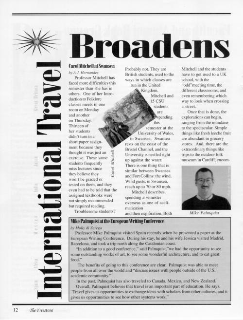
In the 1997 Freestone, sidebars simplified the layout of our faculty travel page.
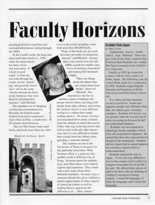
Since Professor Mitchell's experience at Swansea was the main topic, we turned the shorter articles on Professors Palmquist and Krahnke into sidebars.
The sidebar is an indispensable tool, but if you overuse it, your newsletter will look too compartmentalized.
Captions
A caption explains a photograph or graphic image. It might be as simple as the name of the person pictured, or a few lines describing the action or setting. Set them in an italicized version of the body text or headline typeface.
Some professionals recommend putting an 1/8 inch of space between an image and its caption. If there is too much space, it won't be clear that they belong together. Make this decision at the outset so that your placement is consistent from page to page.
Place the caption beneath or alongside the image, or if you have room, hang it out in the margin and surround it with white space. Provided that readers know the caption belongs to the image, there's no reason you can't be creative.
Bylines
The byline describes the author of an article. Use either a short biographical paragraph or just the name.
Set bylines in an italicized version of the body text but make them a point size or two smaller. Select typefaces and point sizes for all elements before you begin the layout.
In the 1997 Freestone, we placed bylines at the top of the first column, causing them to align with the first line of text in the second column. If the bylines had been placed between the headlines and columns instead, the alignment of the body text would have been stronger.
You could also center the byline beneath the headline or put it at the bottom of the last column of text. Look at newspapers, magazines, and newsletters to get a sense of what other designers prefer.
Headers and Footers
Headers run along the top of a page and footers the bottom. Header and footer information is usually mundane but helps organize the publication.
In a textbook, for instance, chapter headings are often placed at the top of the page, which helps readers find their place. In a company newsletter, department headings may appear at the top and the company name or logo at the bottom.
We placed the word Freestone at the bottom of left-hand pages and the words Colorado State University at the bottom of right-hand pages.
When placed as a header or footer, logos and chapter headings become repeating elements that unify the appearance of your publication. Add headers and footers to your style sheet before beginning your layout.
Jumplines
Jumplines tell readers on which page an article is continued. In newsletters, you should limit the number of articles continued on other pages, but sometimes it can't be helped.
When you move text with PageMaker, it will automatically tag one page with the continued on line and the other with the continued from line. Jumplines in the 1997 Freestone were set in 10-point Times New Roman, 2 points smaller than the body text.
Elements of Design
To learn more about creating typographical effects choose any item listed below:
- Typography
- Page Tones: Black, white, and Gray
- Readability Issues
Typography
Typography refers to the reproduction of letters on the page. You're probably familiar with a few different typefaces, such as Times Roman or Courier, but now you need to learn how to combine them.
You don't have to use type styles from ten different families to make a professional looking publication, but combining a few different typefaces improves contrast. There are only a few guidelines to keep in mind.
First, don't mix similar typefaces together. The whole purpose of combining them is to create contrast, so don't mix typefaces that are only slightly different. To make the right choices, you need to understand how typefaces are constructed, so we'll cover some terminology first.
There are two major categories: serif and sans serif.
Serifs resemble pen strokes and extend from the ends of letterforms: 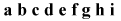 . Look at the lines extending at both ends of the letter a and the top of the letter g. These are called serifs, so this is a serif typeface.
Now look at these same letters again: 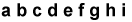 . You'll notice that there are no serifs. The type face is Arial, a popular sans serif font (sans means without in French).
Serif typefaces come in three different styles: old style, modern, and slab serif.
Serif Typefaces
There are three categories of serif typefaces: old style, modern, and slab serif. We will discuss old style and modern on this page and slab serif on the next.
Below, on the left, the word Freestone appears in Baskerville, an old style typeface, and, on the right, in Onyx, a modern style typeface. Both are set at 18 points.


The first difference between the two styles is the angle of the serif. Old style serifs angle downward, while modern ones form a straight line. Compare the letters n in the two examples above.
The second difference between them is the level of contrast between the thick and thin parts of the letterforms. In the old style example, the thick/thin transition of the letters e and o is slight, making the letterforms appear thicker overall. In the modern style, the tops of the letters e and o are very thin compared to the sides, making the letterforms seem thinner than the old style.
Finally, old style letterforms have a diagonal stress, while modern style ones have a vertical stress. In other words, if you drew a line through the thinnest parts of this old style  , it would run at a diagonal, but if you did the same with this modern style
  , it would run in a straight line from top to bottom.
Additionally, old style letterforms have wider bowls, which refers to the amount of space between the sides of open letterforms such as e and o. Some designers believe that this gives text an open, friendly appearance. While others think that the horizontal serif and well-defined thick/thin stroke of modern style typefaces looks more formal. Both are good choices depending on the image you want your publication to convey.
When it comes to body text, some professionals prefer old style typefaces because, at least in smaller point sizes, the thin strokes of modern typefaces can almost disappear, making it harder for readers to identify letterforms. Yet, others argue that the thin strokes give the page a lighter appearance. There is clearly no consensus on the matter, but knowing the facts, you decide for yourself.
Slab Serif Typefaces
Because slab serif typefaces are thick and heavy, most designers use them only for headlines and advertisements. The poor thick/thin transition gives the letterforms a monoweight appearance. The following example is Century Schoolbook at 18 points,

Notice that, like the modern style, the stress through the letter  is vertical, while the serif on the letter n is horizontal. Slab typefaces can be too heavy for body text.
Sans Serif Fonts
Sans serif typefaces have no serifs extending from the letterforms, and there's no thin/thick transition, which accounts for their monoweight appearance. This also means that sans serif typefaces look more alike than different. Compare the Arial on the left, below, with the Futura on the right.


Because there are fewer differences between sans serif typefaces, it isn't a good idea to use more than one per page.
In other words, you can combine an old style and modern typeface because they have different structures, but sans serif typefaces have similar forms. If you put your headline in Arial and your subhead Futura, you'll create conflict, not contrast.
However, within each family of typeface, there are style variations that you can use to improve contrast. For instance, if you use Arial Bold for subheads, use Arial Black for headlines. A heavier weight will make the text appear thicker and darker, so that it stands out better. Differences in point size also create contrast.
Points to remember
In the last three pages, we've discussed the major differences between categories of typeface. You can improve your understanding of these principles by comparing the typefaces in your publishing program. Compare the serifs, the thin/thick transitions, and the diagonal or vertical stress.
Remember the main points:
- Don't mix too many fonts together.
- If you use more than one serif style, choose them from different categories: old style, modern, or slab serif.
- Don't combine sans serif typefaces on the same page. Choose one but use size and weight to create contrast.
Once you understand the principles behind the guidelines, it's easier to break the rules.
On a final note, there are two other categories of typeface: decorative and script. Most designers recommend that these be used sparingly. All the books listed in the bibliography can give you more advice.
X-heights, Ascenders, and Descenders
X-height refers to the height of the lower-case letters in a line of text.
In the word man, the bottom of the letters forms the baseline, while the top forms the x-height. Ascenders are the parts of a letterform that extend above the x-height. In the word dismantle, the tops of the d, t, and l are the ascenders. Descenders extend below the baseline. In the word dismantling, the bottom of the letter g is the descender.
Tracking and Kerning
Tracking and kerning refers to the adjustment of space between individual letters. In leading desktop publishing programs, such as PageMaker, you can set tracking anywhere from very loose to very tight. Kerning allows you to manually adjust the space between individual pairs of letters.
If you tighten the track, the amount of space between letters will be reduced, and you can fit more characters on every line. (Roger Parker suggests that you try to fit between 40 and 60 characters per line. He also believes that the pre-set tracking is usually too generous.)
Reducing the space between letters will darken the columns of text, but increase the amount of white space that can be used more creatively elsewhere on the page. However, if you tighten the track too much, you will reduce readability.
Leading
Leading (pronounced ledding) refers to the amount of space between the lines of type, and it is an important tool for improving readability.
It is set automatically by your software, but it can be adjusted. The default setting usually makes the leading 20% greater than the point size of the body text. In other words, a 10-point font will have a twelve-point leading. In One Minute Designer, Roger Parker offers very useful guidelines.
- Long lines of text should have more space between them.
- Short lines of text should have less space between them.
- In longer lines of text with generous leading, set the body typeface at 11 or 12 points.
- In shorter lines of text with less leading, set the body typeface at nine or ten points.
- Create a template: take a column of text and set it with the standard 2-point difference between type size and leading. Then set the same column of text with a half point less leading, and then again decreasing the leading by a full point. Look at these side by side to see which is more readable.
- Improve the readability of sans serif body text by increasing the leading.
- Tall x-heights need more leading because the ascenders and descenders are shorter and have less surrounding white space.
- Short x-heights require less leading because the tall ascenders and low descenders build-in white space.
The main reason for adjusting leading is to improve readability. Narrow columns should have a smaller typeface and less leading, and wider columns should have a larger typeface and more leading.
Finally, keep in mind that by reducing the space between lines of text, the page will become darker, so you should add white space in other places.
Page Tones: White, Black, and Gray
Unless a publication is in color, white, black, and gray are the only tones on the page. Blank areas comprise the white space, graphics the black, and text the gray.
The goal is to balance these tones on every page. For instance, too much white space can make it hard for readers to follow the flow of a document, and if you clutter the page with too many graphics, rules, and subheads, it will appear dark and busy, while the graying effect of a text-heavy page will discourage even the most interested readers.
Though each tone is equally important, they only have meaning only in relation to each other. White space is only useful if it's contrasted against the black or gray tones. Black tones only provide contrast if there is blank space and text on the page. Good designs balance the three tones together.
White Space
White space serves two very important functions: it provides rest for the eye and draws attention to key points on the page.
For instance, graphics, headlines, and photographs, stand out when surrounded by white space. In flyers and advertisements, wide margins focus attention on the text and graphics. In newsletters, ample margins lighten the page by decreasing the graying effect of the text.
In the 1997 Freestone, we used half inch margins all around and a quarter inch of space between the columns.
You can increase or decrease the white space on the page in several other ways:
- Adjust the amount of space between the columns.
- Use flush-left/ragged-right text alignment to create more white space at the end of each line.
- Customize your leading (space between lines)
- Use tracking and kerning to adjust the space between words and letters.
- Add an extra-wide band of space, a drop sink, to the top of the page.
- Cut articles down to a manageable size.
Rules
Rules are horizontal and vertical lines, which add contrast to the page. Use them to frame and separate information or articles.
In PageMaker, create the line with the drawing tool and fill it using a rule from the Elements pull-down menu.
We framed the top and bottom of every page with a horizontal rule in the Freestone. In some publications, you'll see vertical rules, called downrules, between columns. Many newsletter designers place their pull-quotes inside a column between two horizontal rules.
Rules surrounded by text should be thin, while rules surrounded by white space should be thick.
Borders
Use borders to frame the page. In PageMaker, you can use the drawing tool to create the border and fill it with a rule from the Elements pull-down menu. White space in the margins also works as a border.
In the 1997 Freestone, we used horizontal rules at the top and bottom of each page and white space along the sides. In a newsletter or magazine, repeating the same border from page to page gives your publication a unified appearance.
Boxes
Use boxes to organize information, while adding contrast to the page.
For instance, you might frame the table of contents with a box on the front page, or if you must fit several articles on the same page, turn one or two of them sidebars by enclosing them in a box.
In PageMaker, use the drawing tool to create the box and fill it with a rule from the Elements pull-down menu. In the 1997 Freestone, we used boxes for staff and magazine credits and the table of contents. To view that page, click on the icon below.
There's so much you can do with publishing programs, it's often hard to use restraint, but every element on the page should be there for a reason.
Though the black tones of boxes, rules, and borders help create contrast, they are just organizational tools, and they won't make a page more exciting to read. Plus, overusing them will darken and compartmentalize your publication. If you want to create excitement, experiment with typography and graphics.
Screens
Screens (also called tints) are created by changing the shade of an ink. In PageMaker, you adjust tint from Show Colors in the Windows pull-down menu. To lighten a color, decrease the tint percentage.
To give you a better idea of why and where you might change the tint, click on the icons below.
In the first column of example one, the names of different countries were set at 15% of black, while the sun burst at the top of the column was filled at 25% and outlined at 100%. The sidebars were filled with a 15% tint.
If you fill a box with a screen, it will stand out from better the surrounding text. In PageMaker, you must first fill the box with a solid background from the Elements pull-down menu, and then change the tint from the Show Colors menu.
We have one word of caution, however. Tints can appear darker or lighter on your pre-press proof than they do on the final copy. Discuss this possibility with your printer ahead of time. Our kickers and boxes came out lighter than we expected in the 1997 Freestone.
Layering
Layering text and graphics is an easy way to liven up a page. If it's not text, it's a graphic. You can create simple graphics such as boxes, polygons, and circles using your program's drawing tools.
When you layer graphic elements together, one or more of them will require a screen, which will add gray tones to an otherwise black and white page. In the Freestone, for instance, we layered pull-quotes over star shapes. The graphic element added texture, while its 15% screen added contrast.
We wanted the layout for our pages about student travel to resemble a scrapbook, so we layered text, boxes, stars, and photographs. To view the pages, click on the icons below.
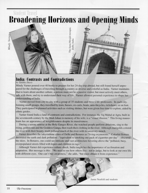

In the first example (page 18), the box was layered over the photographs and the star on top of the box. The text was added last. In the second example (page 19), the box on the right-hand side of the page was layered over the star, leaving most of it hidden from view.
The subject matter was light-hearted, and we wanted the layout to reflect this. We broke a few of the rules but tried to keep everything balanced. Remember our discussion of alignment?
The titles on pages 18 and 19 are aligned with each other but not with the photos and boxes. On page 19, the tall sidebar could have been aligned with the top of the photograph next to it.
Some designers might say that rotated photos create the "look what I can do" effect, but sometimes it's fun to try new things. Once you understand the rules of page design, it's occasionally safe to break away from them.
Photographs
Photos help tell the story, while adding gray tones or color to the page. If the story is about a person, the reader will appreciate a picture.
Except for our travel pages, the photographs in the 1997 Freestone, were all head shots. Which was fine given the subject matter and available space, but we could have made better choices about where the photos were shot.
They were all taken as "mug shots." (Put 'em up against the wall, point the camera, and shoot the picture.) An outdoor background is always better than a wall, but sometimes rushed schedules don't allow for more.
Roger C. Parker's Looking Good in Print is one of the more well-known desktop publishing books from which he offers the following advice.
- If you use more than one photo on a page, make one dominant and place it in a prominent spot on the page.
- Decide which photo best captures the gist of the story.
- Good photos have an emotional impact on the reader.
- Crop mug shots closely to keep the subject's face the focus.
- Improve the brightness and contrast of the photograph with image-enhancement software such as Adobe Photoshop.
You'll have to scan your photographs before you can place them as graphics in your publication. These digital images must also be given to your service bureau or printing service. In the world of printing and design, photos are often referred to as halftones. We discuss scanning and halftones in Going to Print.
Readability Issues
Readability refers to how efficiently a reader's eyes follow the flow of the text. Since effective communication is the most important goal in page design, you should acquaint yourself with the issues of readability.
The Physiology of Reading
Layout that facilitates natural eye movements improves reader comprehension. According to Colin Wheildon, author of, Type & Layout: How typography and design can get your message across--or get in the way, American children are taught to begin reading at the top left corner and work their way across the page from left-to-right until they reach the bottom right corner.
Any design working against this principle may frustrate readers. For example, if you place the headline in the middle of the page, readers will have to return to the top before they can begin reading the body text, which contradicts natural eye movement.
In Wheildon's research, sixty-seven out of 100 test subjects reported good comprehension on layouts that supported natural eye movement, while only 32 readers reported good comprehension on those that disregarded eye movement. (42).
Typography and Readability
Wheildon provides useful statistics on how typography affects readability. The main question is whether readers prefer serif or sans serif typeface for body text.
Tradition has always favored serif type. Wheildon cites a 1926 study by the British Medical Council that concluded that the absence of serifs caused an "optical effect where the lines of type intruded into the letters, setting up a form of light vibration, which militated against comfortable reading" (56).
Wheildon came to the same conclusion through his own research and advises editors to use serif typeface for the body text. He found that the majority of his subjects reported trouble maintaining their concentration when sans serif body text was used instead (57).
Headline typeface was another matter, however. According to Wheildon, sans serif ranked higher when readers were rating headlines, but the statistical difference was negligible. He advises that editors choose a headline typeface based on what is most suitable to the image of their publication.
Uppercase vs Lowercase
Wheildon gives statistical analysis that supports readers' preference for lowercase headlines over those which use uppercase for every letter. Since readers recognize letters by their tops, uppercase heads are more difficult to read (62.) We used lowercase headlines but capitalized the first letter of each word, but even this is considered outmoded by some. Roger Parker and Jan V. White recommend that you only capitalize the only the first letter in the first word of a headline and use lower case for the rest.
Text Alignment
Wheildon claims that fully justified body text (aligned flush-left and flush-right) is superior to flush-left/ragged-right alignment. Full justification creates even lines of text, which, according to Wheildon, makes for a smoother eye movement from line to line.
Conversely, ragged-right alignment creates uneven spacing at the end of each line, but the spacing between words is even. On the other hand, full justification causes uneven spacing between words. In other words, there is always the same amount of space, but one puts it after the line of text, while the other forces it between words. The following is an example of justified text. Notice the uneven word spacing.
Full justification also increases the number of hyphenated words. So, which should you use? There is no consensus on this point. Some magazines and newspapers justify the body text, while others use flush-left/ragged-right.
Most design decisions are subjective. There are only guidelines, not hard and fast rules. However, if you decide to justify the text, set minimum and maximum spacing between words to help prevent "rivers of white space" from cropping up between words.
In Looking Good in Print, Roger Parker cites other experts who argue that readability is improved by flush-left/ragged-right text alignment. They claim that even word spacing makes it easier for readers to recognize word groups.
Parker claims that many newspapers and magazines use justified type to increase word density and save money. He prefers ragged-right text because the open space at the end of each line lightens the appearance of a publication.
Column Width
Following the flow of a document can be difficult when the columns are either too wide or narrow. However, you can't determine column width without considering type size and leading.
With narrow columns, for instance, the eye scans down the page very efficiently, unless the type size is too large. A 12-point type in a narrow column will result in fewer words per line. On average, try to fit at least five to fifteen words per line. Create a few templates, compare them side by side, and then ask yourself these questions:
- How efficiently do your eyes scan the page?
- Does the amount of white space between words and lines make reading easier or harder?
- Do you find the number of hyphenated words distracting?
- Do the lines of text seem either too short or too long?
- Do your eyes get lost looking for the next line, or do they move easily down the page?
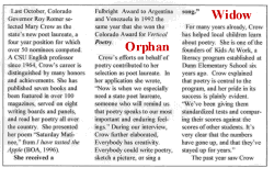
Avoid Orphans and Widows!
Orphan is a term used to describe a single word appearing at the bottom of a paragraph or column. A widow is a single word or short phrase appearing alone at the top of column. They add "rivers" of white space and interfere with eye movement from one line of text to the next.
You should also avoid putting less than three lines of a new paragraph at the bottom of a column. Fewer than three lines will make it harder for the reader to keep information organized. The example below demonstrates all three points.
White space can be under-used, overused, or just carelessly used. Good control of white space can improve reader comprehension. For instance, too much space between a column of text and a new subhead can interrupt the eye movement of your readers. Generally speaking, it's easier for people to read quickly if the spacing between words and lines isn't too lose.
Also, pay close attention to the space between paragraphs. If you indent the first line of text, then don't insert extra spaces between paragraphs. Do one or the other. Magazines generally indent and minimize space between paragraphs. Some newsletter designers use block paragraphs and add space between them.
Going to Print
To learn more about the final stages of production:
- Halftones
- Creating Halftones: your options
- Scanning
- Scan Resolution
- Pre-print Options
- Questions Your Printer will ask
Halftones
A halftone is a reproduction of a photograph on paper. That's the definition, but if you want to learn more about the technology behind halftones, read the next two paragraphs. To learn more about creating halftones with your scanner, go to the next page.
To reproduce the gray tones of a black-and-white photograph, printing services convert the photo into a series of black dots so small that the human eye blurs them together with the surrounding white paper. The lighter areas of the photo are created by small dots and the darker areas by large dots.
You're more limited when you try to reproduce a photo using your personal computer. Since your output device can only make dots of one size, it must group the dots together into halftone cells. Then it reproduces the lighter tones by turning some of the dots off in each cell, while turning more of them on to create the darker tones.
Creating Halftones: Your Options
Okay, you've taken the photographs, now what? You have a few options. Use a scanner to create digital images of the photographs. Have a printing service create halftones with traditional methods. Do both.
If you have an 8-bit scanner, creating digital files is simple, and you can use the images during the layout. However, if you use your scanned images as the final for printing, you also have the burden of making them look good. The typical printing service won't take responsibility for photos unless it creates the halftones. Most services charge somewhere between seven and fifteen dollars to shoot each halftone, but the responsibility is all theirs.
On the other hand, if you have image editing software, such as Adobe's Photoshop, with practice, you can create fine camera-ready images and save money. The 1997 Freestone had around 30 photographs, and we saved a considerable sum of money by scanning and editing the images ourselves.
Scanning
We're not going to teach how to scan photos here, and chances are you've already done it. But we will discuss getting your scanned images ready for your printing service.
Photos and screens are all halftones. Remember those boxes we talked about earlier. If you fill a box with a 30% tint, then your print shop or typesetter will reproduce it with halftone dots. Why is this important? Well, there are coarse screens and fine screens, which are all measured by the number of dots per line.
For instance, coarse halftones may have less than 60 rows of dots per inch. The more rows of dots per inch, the finer the appearance. This is referred as the line screen and is measured as lines per inch (lpi). Finer line screens, around 133 lpi, have more cells per inch. The lower the lpi, the more visible the rows of dots, especially when printed at a low resolution, such as 300 dpi.
Images with a high lpi, look better when they're reproduced by output devices with a high dpi. So higher is better, right? Not necessarily, and this is where good communication with your printing service is important.
The line screen you choose should be based on a combination of factors: the quality of the inks, paper, and printing device being used. If you set the lpi too high, your printing service may have trouble reproducing the images on the paper stock you've chosen, so ask them for a recommendation.
Specify the line screen through your image editing software, or in PageMaker, open the Elements pull-down menu and select Image Control.
Scan Resolution
When it comes to scanned images, a higher resolution isn't always better. Image resolution is measured as pixels per inch (ppi), and images scanned at a higher resolution store more information in the digital file.
You should relate ppi to lpi. Set the ppi at roughly 2 times the line screen (lpi). If your printer suggests that you use an lpi of somewhere between 70 and 106, you'll probably want to scan your photos with a ppi of between 150 and 175.
If you hire a service bureau to produce your camera-ready copy, you can scan images using the higher ppi. In any case, it's a good idea to discuss both scan resolution (ppi) as well as line screen (lpi) with your printing service ahead of time.
Pre-print Options
The Freestone is a high-end newsletter because it's printed on magazine quality paper with a slightly glossy finish, and the final product is printed by a professional printing service.
This also makes it more expensive to produce. So, if you're on the Freestone staff this semester, you now know that you won't be printing 3,500 copies of this year's edition on a laser printer.
However, if you must produce your newsletter on a tight budget, using a high-end laser printer might be an acceptable option. Unfortunately, you won't get the same quality from a laser printer as you will from a commercial printing or quick printing service.
If you've already decided to use a printing service, then the next decision you must make is whether to give them a final proof from your laser printer, or hire a service bureau to make a camera-ready copy on an imagesetter.
If you really want high-quality results, go to a service bureau. Service bureaus take electronic copies of your publication and create camera-ready output to either paper or film for your commercial printer. They are a middleman in the process.
Commercial print shops make printing plates directly from the film negatives. Imagesetters can print to paper or film at resolutions up to 2450 dpi. This is very high considering that most laser printers only have a dpi of 600. Your print shop should be able to direct you to a local service bureau.
Remember, you don't have to use a service bureau. Printing services can shoot film negatives from a laser printout. However, the quality of the finished product will be higher if you take advantage of the high-resolution output of the imagesetter.
One word of caution: if you hire a service bureau, proofread a draft of what they plan to shoot on film. It's much more expensive to have them to redo the negatives later.
Here are some other tips on working with service bureaus:
- Before you hire them, make sure that they use the same desktop publishing software as you.
- Find out how they want you to transfer your file to them. On a zip disk or via the Internet?
- Give them a laser printout.
- They'll need copies of all your scanned images and clip art.
- They might need copies of your fonts, too.
Other Questions Your Printer Will Ask
Most newsletters and magazines are comprised of sheets of paper that are 8 1/2 x 11 inches, but this is only after they've been printed, folded, and stitched. Often printers begin with an 11 x17 inch piece of paper and print one page per quadrant, but this can vary from press to press.
Each quadrant is 8.5 x 11 inches, so a 24-page spread is comprised of six pieces of 11x17 inch paper. The first 11x17 inch piece will have pages 1 and 24 facing each other on one side, and pages 2 and 23 on the other. The second 11x17 inch piece will have pages 3 and 22 facing each other on one side, and 4 and 21 on the other. Each printer spread is then folded into a booklet form known as a reader's spread, where the pages face each other in sequential order.
Why do you need to know this? Your printer may ask you if you'll be providing your file as a printer spread or reader spread. Sometimes they charge you a stripping fee to turn the pages into printer spreads.
Next, after everything is printed, the papers are bound together with saddle-stitching or a side-stitching. Smaller publications are usually saddle-stitched, meaning that the staples are driven through the spine of the booklet. Nonetheless, your printer may ask you what type of binding or stitching you prefer.
Your other major decision is what type of paper to use, coated or uncoated. Coated papers produce better clarity, especially for halftones. This is because uncoated papers absorb more ink. But if you really need to keep costs down you might have to choose lower grade paper.
The easiest way to choose a paper is to touch different samples. Papers are described in pounds and finish. The Freestone was printed on a 70# paper with a matte finish. Generally speaking, 60# and 70# are adequate. The different finishes are offset, linen, smooth, matte, and gloss.
If this is your first major project and you don't yet have a printer to work with, then find one early on. Compare prices, but also find one who you feel will give you the attention you need to learn the ropes. See if they'll meet with you one-on-one. If you know what they expect of you, and what you can expect in return, you'll save yourself trouble later.
What could be worse than spending countless hours making a great product on computer only to have it turn out wrong at the print shop?
Bibliography
Doty, David and Joe Grossmann. Newsletters from the Desktop: The desktop Publisher's guide to designing newsletters that work. Ventana Press, 1994.
Evans, Poppy. A Designers Guide to Faster, Better, Easier Design and Production. Cincinnati: North Light Books, 1993.
Felker, Daniel B. Ed. Guidelines for Document Designers. Washington, DC: American Institutes for Research.
Lupton, Ellen and J. Abbott Miller. Design Writing Research: Writing on Graphic Design. New York: Princeton Architectural Press, 1996.
Parker, Roger C. Newsletters from the Desktop: Designing Effective Publications with Your Computer. Chapel Hill: Ventana Press, 1990.
---. Looking Good in Print. Chapel Hill: Ventana Press, 1988.
---. One-Minute Designer. MIS Press, 1997.
Siebert, Lori and Lisa Ballard. Making a Good Layout. Cincinnati: North Light Books, 1992.
Shushan, Ronnie, Don Wright, and Laura Lewis. Desktop Publishing by Design: Everyone's Guide to PageMaker 6. Microsoft Press, 1996.
Wheildon, Colin. Type & Layout: How Typography and Design Can Get Your Message Across--Or Get in the Way. Ed. Mal Warwick. Berkeley: Strathmoor Press, 1995.
Williams, Robin. The Non-Designer's Design Book. Berkeley: PeachPit Press, 1994.
Lehti, Mary. (2003). Desktop Publishing. Writing@CSU. Colorado State University. https://writing.colostate.edu/guides/guides.cfm?guideid=36