

Poster Sessions
A successful poster is not created overnight. Preparing a well-organized, visually-pleasing poster requires you to plan well in advance. First, consider your audience and what type of poster you'll create. Next, gather your supplies and decide what information to include. From this point, create the text and graphics. Remember to consider how these work together and then format your poster accordingly.
Definition of a Poster Session
A Poster Session advertises your research. It combines text and graphics to make a visually pleasing presentation. Typically, a professional poster involves showing your work to numerous researchers at a conference or seminar. This can take place in one large room, several smaller rooms, or even on a balcony. Then, as viewers walk by, your poster should quickly and efficiently communicate your research. Unlike the fast pace of a slide show or verbal presentation, a Poster Session allows viewers to study and restudy your information and discuss it with you one on one. You may also be required to give short presentations on your research every ten or fifteen minutes.
A less formal poster presentation occurs at general forums such as health fairs. The posters at these sessions present general information and invite viewers to ask more detailed questions of the presenters.
Purposes for Poster Sessions
Although most poster sessions occur as part of professional conferences, posters also appear in more open forums as a way to disperse information to the general public. Both the purpose and the audience for the poster determine important elements of the poster itself.
Professional Posters Inform and Argue
When a professional presents original research, the goal of the poster is twofold. Not only should the poster present the data and findings uncovered in the research, but the poster also presents an argument for the validity and importance of the research. Although the argument seems secondary, it's a key factor in helping the writer decide what material to include in the poster.
The fastest growing variation of the professional poster session is the Internet session. Professionals prepare posters about their original work and post them on the Web. Instead of walking around viewing others' posters at a conference, participants of the virtual poster session view others' posters online. Electronic forums then allow participants and other audiences to ask questions of the poster authors. In the sample linked below, notice that the text is considerably longer than the authors could include on a physical poster, but the virtual poster eliminates the space problem that a physical posterboard imposes.
"General" Posters Inform
The other major type of poster—the informational poster—is typically shaped more by its audience than by its purpose. When a poster session is organized to spread information, writers need to consider how much background information viewers/readers are likely to know. Then writers can determine the appropriate detail to include on the poster. Because the intended audience for a poster can vary so widely, writers should always consult the session organizers to learn about the expected audience.
Audiences for Poster Sessions
When a professional organization, say the American Heart Association, holds a conference with a poster session, the sponsors expect poster writers to present research for other informed specialists in the field. But even the professional poster might be viewed by less technically skilled readers. If you're planning a professional poster to present your research, find out as much as you can about possible audiences.
Audiences for Professional Poster Sessions
With a few key exceptions, most conferences in highly specialized fields draw only informed experts in that field. However, don't assume that those investigating your research know a lot about your topic. Ask the conference organizers for information about who generally participates in the conference. Once your research has been accepted for a conference, you should investigate the credentials of those who've attended previous conferences. Most organizations publish proceedings, listing the credentials of past presenters. These will provide you with background information, such as where your audience is from (universities, organizations) and what their interests are, as well as their past research topics.
With this background information, you can shape your poster for the specific audience. You're more likely to capture your audience's attention and to avoid presenting obvious information or talking above their heads.
Key Exceptions
If you're preparing a poster on a health or high tech topic, the audience may include media reporters. Generally, these reporters are well versed in the technical aspects of the field, and so they will be able to read your poster without difficulty. But you might want to have a list of references for background reading handy just in case someone asks for the context of your research.
If you're preparing a poster for a technical group that has close ties to business or consumer outlets, you might also have a mixed audience for your poster. Be sure to ask the conference organizers how many non-specialist viewers are likely to be present. You may not decide to change the content of your poster, but you might prepare supplementary handouts for viewers who ask about background or commercial extensions of your work.
Don Zimmerman, Journalism and Technical Communication Professor
The credentials you find listed in conference proceedings can give you a pretty good insight into at least a portion of those attending a conference. These usually provide biographical sketches--paragraphs anywhere from 50 to 100 words long. Typically, most folks won't go to a conference unless they have a chance to do a presentation and as a general rule, you won't find people there from off the streets.
Audiences for General Poster Sessions
General audiences are the hardest to write for because it's impossible to write to accommodate all the levels of background knowledge viewers will bring to your poster. Several approaches might help:
- Think About Where the Poster Session Will Be Held
- Even if you know that typical viewers will include readers with almost no background knowledge about your topic, you still need to decide what's most important to present on your poster and every bit of information about the audience will help you plan your poster. If you're writing a poster for a career fair, for instance, knowing that it will be held at a high school or at a college will make a difference in your probable audience. If you were describing actuarial science for a high school career fair, you'd need to explain just what actuaries do as well as the job prospects for qualified actuaries. You'd certainly want to include the basic requirements that students will need in their first years of college, but you might decide not to detail the levels of testing that actuaries complete for full certification.
- Ask the Organizers
- Ask the organizers what kinds of posters have been most successful in the past. If they have samples, look at those to determine the level of background knowledge that seems to work best. If not, ask the organizers where they've advertised the poster forum. If they expect to appeal to the entire community for a health fair, for example, you can assume little background knowledge. If they expect to draw in only math students from the highest-level courses offered in local high schools for a career fair, then assume viewers will have much more background knowledge.
- Draft Alternative Texts
- Draft several alternative texts for posters and ask a wide range of viewers to tell you which ones seem clearest. You won't need to draft the entire poster for your samples. Instead, focus on one or two key sections—perhaps the text that defines the topic or scope of your poster and the section that explains what viewers should do now that they've read the information on your poster (for example, the text that describes how to stop spreading a common infection among school children). Try out your alternative versions on a few readers with the same level of background knowledge you expect of viewers of your poster. Ask specifically about which version makes the most sense or seems most interesting.
- Prepare Supplemental Handouts
- Write your poster for the readers who have very little background knowledge but prepare supplemental handouts. If you take this approach, be sure to "announce" on the poster that the handouts are available. If you don't have time to prepare detailed supplements, at least put together a reading list so that the reader with some background will have a good idea of where to look next for more detailed information.
How to Deal with Mixed Audiences
Even though professional conferences draw few outsiders, occasionally someone with general interest in the topic will attend a poster session designed for experts. Especially as more conferences and poster sessions are announced on the Internet, we should expect more non-expert viewers to attend poster sessions. The best rule of thumb is not to write the poster for these readers but to have a few key references available to share with these viewers.
Marilyn Levine, Asian History Professor
The poster session audience varies according to what kind of conference you're attending. Generally, for the Social Sciences and Humanities one might assume that the audience has some expertise in various methods (such as quantitative methods, or specialized terminology); but the presenter wants also to have enough background so that a more general audience, with minimal knowledge can still obtain some knowledge from the poster. Thus, you might want to have a brief background section as one part of your paper or figures that give capsulized information.
For example, when I did a poster comparing Ho Chi Minh and Ngo Dinh Diem, the main theme was the misconstruction of Western leadership ideas in terms of their leadership. But how did I acquaint an audience with who these leaders were? For the more general audience I developed chronologies in an attractive, laminated, and mounted display. In addition, I had photographs of people and one memo in an arranged section. For the more specialized audience I discussed the ideological development of each leader (without for example, explaining Marxism or Personalism), and then had a specific case study of their leadership in power. In the conclusion, I suggested my ideas in bulleted format as to discussion ideas based on the narrative. Thus, readers who were interested in Asian leadership could learn and ask about the more general history of these two leaders, or interchange ideas on the larger implications of their leadership. Remember, your audience will be able to directly ask you questions, or raise issues or even provide you with information.
Writing Strategies for Poster Sessions
Developing your poster’s content may seem like a breeze. After all, you just have to cut and paste parts of your research onto the board, right? Wrong! To be successful, a poster requires planning how you will depict specific information and providing text and graphics to capture your audience’s attention.
The final material that goes on a poster is quite unlike what most researchers and writers generally write for other contexts. The poster session calls for much more attention to visual impact than other forms of writing do. And the restricted space of a poster requires careful condensing of ideas that we would write about at length for other forums.
In this section, we suggest a few strategies that may help your draft and revise your poster.
Focus, Focus, Focus
Unlike a research-based paper, which might run from 15 to 80 pages (or more), a standard poster session will include only about 3-4 pages of single-spaced text or graphics in 12 point font (i.e., before formatting for the poster). In other words, writers for posters have very little space to fill, particularly if they have to explain complex ideas or research. The key to crafting a good poster, then, is to focus as narrowly as possible on the central ideas you need to convey. You just won't have room to explain relationships among ideas in any detail, so pick out what's central to your topic and concentrate on that narrow focus.
When Kate Kiefer and Mike Palmquist completed an in-depth research study of four classrooms in 1993-1994, they knew that they couldn't present all their results on a poster. Instead, they drafted two preliminary research papers (running 30 pages and 40 pages) and then chose a focal point from all the data for one poster session. The poster session text and graphics fill only three pages (not yet formatted for the poster) because these authors focused on one key result—students had more contacts with teachers in computer classrooms than in traditional classrooms. (A complete discussion of their work eventually turned into a 300-page manuscript for a book.)
Working From a Drafted Paper
Many writers find it easier to draft a complete research paper and then to use that draft to help focus on key points for the poster than to begin with the poster format as a starting point for writing. When you start with a draft, you can see more easily the range of material you have to choose from, and obvious focal points for the poster might jump out. Moreover, the organization of the draft may help you see clear headings for parts of the poster.
Once you have your research paper, then you can cut parts from the draft to begin compiling text and graphics for the poster. Be careful, though, not to stop at that point. The compiled material will still be too dense if you don't revise carefully for the poster format.
Working From Notes
Some writers prefer to work from notes rather than from a draft of a paper because they see the full draft as too dense or detailed to revise for a poster. Especially for a general information poster, you may prefer to move from notes directly into drafting chunks for the poster. If you draft from notes, be sure to state the key pieces of information that need to be included on the poster. Focus on those key points and work back and forth between key information and possible headings that cluster the information. Question yourself about audience and focus over and over as you flesh out the chunks of your poster. And then move into revising to be sure that you have included clear and appropriate information.
Clark Harris, Gary Maricle, and Bob Birkenholz offer this advice for drafting from notes:
A working title and list of facts or points to be communicated should be prepared. A sequential ordering of the points and an outline of the presentation is also necessary. By making a flow diagram, grouping ideas and facts, an orderly design may be sketched to organize the flow of information being presented. In preparing text, a good general guideline is 'keep it simple.' The audience will only carry a few ideas away with them no matter how grandiose the presentation. The desired message should be expressed in as few words as possible.
The poster presentation is a summary or abstract of an idea, activity, or research. Only the amount of information that can be absorbed by the viewer in five minutes or less should be presented. If more time than this is required by the reviewer, the presenter can verbally communicate additional information to the interested party. Pictures and words must work together to amplify, clarify, and extend the focal point of the poster. Adding details and specific examples is acceptable: however, 'busy' or 'wordy' posters can interfere with the process of effective communication. Above all, when planning poster presentations, read and follow the instructions and guidelines provided by the sponsoring organization.
The contents of a poster are similar to a research paper, slide presentation, or other scientific communication. The poster should flow from left to right and top to bottom.
Harris, C., Maricle, G.L., & Birkenholz, B. (1990). "Poster Presentation: The Key to Communication of Ideas." Paper presented at the Annual Meeting of the American Association for Agricultural Education/American Vocational Association (Cincinnati, OH, December 6, 1990). ED333491
Revising
Revising an early draft of poster material involves a process unlike that called for by most traditional papers. Most writers don't worry much, if at all, about layout issues when they write typical papers, but the poster writer needs to consider layout early and often as she writes and revises poster text and graphics.
Related Information: Example Poster
Statement of the Problem
As writing classes move into non-traditional environments, teachers must look at how the learning/teaching environment affects students. Our study recorded contacts that students had with peers and teachers. We were concerned both about changes that the setting might induce in electronically-supported interactions as well as changes in face-to-face and other student-student and student-teacher interactions.
Methods for Collecting Information about Interactions
Our year-long study focused on four teachers (two in fall semester, two in spring semester) and 174 students. Each teacher taught the same freshman composition course in both a traditional and a computer classroom. Teachers adjusted materials and activities based on the classroom setting, but all data-collection techniques were the same in both settings.
We used multiple data-collection methods to capture as much information as possible about student-student and student-teacher contacts.
- contact sheets
- teacher logs
- electronic mail records
- classroom observations
- teacher interviews
Results
Based on students' self-reported contacts in all eight classrooms, students talked with classmates and with teachers significantly more often in the computer classroom than in the traditional classroom. Students reported on average 57.1 contacts with classmates and 18.1 contacts with teachers in the computer classroom. Students reported 39.1 contacts with classmates and 12.1 contacts with teachers in the traditional classroom.
| Teacher | Setting | No. of students | Out-of-class contacts* | Out-of-class E-mail contacts** | Total out-of-class contacts |
|
Anita |
Traditional | 23 | 56 | 0 | 56 |
| Computer | 20 | 46 | 40 | 86 | |
|
Caitlin |
Traditional | 25 | 59 | 0 | 59 |
| Computer | 22 | 60 | 178 | 238 | |
|
Candace |
Traditional | 25 | 46 | 0 | 46 |
| Computer | 25 | 42 | 30 | 72 | |
|
Sarah |
Traditional | 25 | 183 | 0 | 183 |
| Computer | 23 | 188 | 43 | 231 |
Table 1. Student-teacher face-to-face contacts as reported in teacher logs.
*includes before and after class, in office, via telephone and notes
**includes only electronic mail sent to or from the teacher outside of class
As Table 1 shows, out-of-class contacts were about the same for each teacher in both computer and traditional settings. But because students in the traditional classes did not avail themselves of electronic mail, total out-of-class contacts were much higher for students in the computer sections. Thus, electronic mail, although not used extensively by students, supplemented other out-of-class contacts with teachers for the computer classroom students.
Classroom Observations
Each class was visited three or four times each term, typically once a month. Typically, the observer noted all interactions between students and the teacher, including the teacher calling on students or students participating in discussion. The observer also noted when the teacher made a one-on-one contact with a student.
Because of potential differences in observer judgments, we present ratios rather than averages of student/student, student/teacher contacts initiated by the student, and teacher/student contacts initiated by the teacher (see Table 2).
|
Teacher |
Student/Student | Student/Teacher | Teacher/Student |
|
Anita |
3.4 | 2.3 | 1.5 |
|
Caitlin |
1.5 | 1.2 | 0.8 |
|
Candace |
1.6 | 3.1 | 1.2 |
|
Sarah |
1.4 | 1.4 | 1.6 |
Table 2. Ratio of contacts in computer and traditional classrooms, by
teacher, recorded during classroom observations
These data, like those collected on the student contact sheets and in the teacher logs, suggest that students are more likely to have increased contact with peers and teachers in a computer classroom setting than in a traditional setting.
Key Findings
1. Student Contact Sheets
The computer students consistently reported more contacts—both with peers and with teachers—than their counterparts in the traditional classes. The computer setting thus appears to contribute to students' willingness to share their writing openly and to elicit peers' and teachers' commentary on their writing as it develops.
2. Student-Teacher Contacts
Students contacted teachers in about equal numbers outside of class—until we add in the electronic mail contacts, and then all four teachers show substantial increases in the total number of contacts with students in the computer classes over students in the traditional classes. Students in the computer classes who used electronic mail did so to supplement the typical contacts they would have otherwise had with teachers.
3. Classroom Observations
The observed student-student contacts consistently favor the computer classroom setting as a site for greater interaction between students. Students in three of the four comparisons show between 40 and 60% more contacts in class; the other set of paired classes has 3.5 times as many student-student interactions in the computer classroom as in the traditional classroom.
Student-teacher interactions initiated by the students also markedly favor the computer classroom. All four teachers interacted with students more frequently in that setting, and two teachers were approached by students between two and three times more often in the computer classroom than in the traditional classroom.
Thus we see a third indicator that suggests the same result: students and teachers interact more frequently in computer classrooms than in traditional classrooms. Even more noteworthy, students talk to their peers about their writing more often in computer classrooms than in traditional classrooms.
4. Teacher Interviews
What emerges from the interviews is a consistent trend among these teachers: teaching in the computer classroom changed the dynamic of the class in such a way that students were more willing to share their work. As a result, teachers were better able to see what students were writing and to make helpful suggestions to improve the papers as products and the students as writers. The teachers themselves, while not uniformly enthusiastic about all aspects of teaching in a computer classroom, concurred that students benefit from the flexibility in pacing (so that teachers can speak with students individually about a paper that is then being drafted or revised) and the freedom to request help from peers that the environment encourages.
Related Information: Example Poster Excerpts
Key Findings
1. Student Contact Sheets
The computer students consistently reported more contacts—both with peers and with teachers—than their counterparts in the traditional classes. The computer setting thus appears to contribute to students' willingness to share their writing openly and to elicit peers' and teachers' commentary on their writing as it develops.
Related Information: Example Research Paper Excerpts
In the research paper noted before, Kiefer and Palmquist had the time and space to develop their findings in detail. One section of the final paper, "What Does the Data Suggest About Student Interactions," included this discussion of the student contact sheets:
Because a member of the research team distributed the first contact sheet and gave students instructions on how to complete it, and because subsequent reminders were given to all four teachers and delivered to students in the same way, we can be reasonably confident that students completed the forms in the same ways in both traditional and computer classes. And yet the computer students consistently reported more contacts than their counterparts in the traditional classes.
Moreover, as one teacher noted, students in the computer classroom may not have been recording as many contacts as they probably had: 'I don't know if they're writing those kinds of contacts [chatting in class about their papers] down on their contact sheet. Probably not. They see it as really normal interaction' (Caitlin, Interview Two). The teachers all noted that in the computer classroom students seemed much more comfortable talking to each other, and that most of the student-student talk focused on writing issues and papers-in-progress.
The computer setting, then, appears to have contributed to a greater extent than did the traditional setting to students' willingness to share their writing openly and to elicit peers' and teachers' commentary on their writing as it developed.
The Transport Problem
Choosing what type of poster to create depends not only on how you present your information but also on several other factors. In this section, we discuss different overall designs for posters and why you might choose one over the other.
Once you know your purpose in preparing a poster and the types of readers to expect as viewers of your poster, your next decisions will all be constrained by transporting and setting up the poster. First, find out whether the conference guidelines specify a particular size or display format. If no guidelines are listed, inquire about what facilities are available to you. For instance, must you bring your poster completely assembled? Must the poster fit on a table, or can you use a cork board or wall to display your poster? Can you use multiple sheets of posterboard or wall space equivalent to two or three posterboard sheets? Next, consider how you will get your poster to the presentation. If you have to fly, will the poster fit overhead? How about in the back seat of a car? Considering these factors ahead of time means less frustration on the presentation day.
Pin-up Posters
With the pin-up poster, each sheet or board is separate. These are typically the easiest posters to transport. This display format does require attention to formatting details so that each sheet or board is uniform with the others. You'll also need more set-up time on site, particularly if you're pinning sheets to corkboard or the wall. Finally, you will need to have the sheets in order so that you can pin them up quickly without worrying about layout at this point.
International conferences typically allow for pin-up posters of some sort to alleviate the problems in transporting large posters via airplanes.
Tabletop Posters
Like the typical Science Fair poster, this type stands on a table. Typically, these posters are approximately two by four feet in size. They are held together with tape along the back side or they are bent to create "wings" that support the posterboard upright. Because they fold together, they are relatively easy to transport by car but can be awkward on airplanes. If you need to travel by air and the conference requires a tabletop poster, ask the organizers if they will supply posterboard or an alternative on site. Most conferences will do so or will arrange for office supplies—including posterboard—to be available for purchase on site.
Floor Posters
Floor posters usually require expensive materials and are much more difficult to transport. Because they stand on the floor, these posters are larger than the others, but conferences will often allow posters to take up more table or wall space than a single posterboard would require (40 X 32).
What to Include
Unlike other longer forms of writing, posters typically need to get right to the heart of the matter. Because viewers take only a few minutes to decide whether to study your poster in detail, you need to catch their attention and present the most important information and results of your work. Deciding what to include, then, is a key element in your poster's success.
Because the purpose and audience of the poster session determine so much about content, we first take up general concerns about content and then address content for three different kinds of posters—the professional presentation poster, and the general information poster.
General Concerns about Content
Cutting and pasting a research-based or informative paper onto a poster provides too much information and will overwhelm poster viewers. To get and keep your audience's attention, consider what information sums up your work or is most important for your viewers to know. Then think about how you can best depict it—through graphics or text. Typically, the less text, the more appealing the poster is.
Text
Because posters condense a great deal of information, the tricky part is determining what information is relevant for your particular presentation. If you depict too much information, few viewers will read your poster completely. If you depict too little information, viewers may not realize they're missing key information. One of the most common mistakes in developing a poster is relying too heavily on text and trying to include too much textual explanation.
Because viewers can take in visual information much more quickly than they can read text, use graphics whenever you can on a poster. But when you could oversimplify and thus mislead by using a graphic, stick to text instead. Don't try to include the most complete explanations of complex ideas on a poster, but do use text to convey key points and to announce that you have supplemental handouts. Also, make your text easy to read by chunking information in bullets, lists, or short paragraphs and use clear headings throughout.
Graphics
Graphics are more pleasing to look at than paragraph after paragraph of text. However, if a graphic requires lengthy textual explanations, you should reconsider how effective it really is. In general, a poster graphic should speak for itself. A title or heading helps the audience understand its content, but overall you should keep written explanations to a minimum.
Professional Presentation Posters
Often, a poster captures several years' worth of work. The tricky part is determining what information is relevant for your particular presentation. If you depict too much information, it's likely no one will read your research completely. If you depict too little information, others may not realize your research's impact. Keep in mind your audience as you choose which parts of your research to emphasize. Then note these special concerns about text and graphics for the professional poster.
One of the most common mistakes made when creating professional posters is providing too much text-based explanation. After looking at numerous posters in a matter of a few hours, the last thing your audience wants to do is read your entire paper. As a general rule, you should present two to three key points from each of your paper's sections. Typically, a poster always includes an abstract, the research questions/problems, methodologies, results summarized, and conclusions. Under these headings, though, be sure to include focused information. If your results lead to multiple conclusions, ask conference organizers to include your work in multiple sessions. Also, always have copies of your paper with you for those viewers who want more extensive details.
Only rarely is research so focused and narrow that a poster can include all the data, results and conclusions of a professional research project. As you choose the information to present on the poster, don't rely solely on graphs and tables you've already drafted for a formal paper on your research. Instead, look at key information in a new light and choose the best visual forms to present the subset of data and results you decide to highlight on this poster.
General Information Posters
The danger to avoid when preparing a general information poster is oversimplification. Because viewers probably don't know much about the topic, many posters oversimplify too much. Then the information can be distorted or easily misunderstood.
As you work on your poster, keep asking yourself these questions about content: Have I presented the most important information for viewers to walk away with? Is there any way that viewers could misunderstand the key points I present?
Because your poster will be competing with all the others at the forum for viewers' attention, you need also to take time to consider the visual attractiveness of your poster. This type of poster needs to appeal to the eye as well as present information clearly.
To increase the visual appeal of your poster, especially across the large spaces that general forums occur in, you might consider using more color in the poster and a greater contrast between heading and text fonts. Your poster title or topic could be displayed in 72 point font, for instance, with headings throughout the poster in 48 point font. Do not use italic or elaborate script fonts, though. Even though they will appear distinctive from a distance, these fonts are much harder to read. If at all possible, use color in your graphs, charts, and diagrams, and use pictures or drawings wherever possible to add color and visual variety to your poster. Also, be sure to break up your textual elements with bulleted and numbered lists.
Chunking text under clear headings is one key to a successful general information poster. If you draft your poster text and discover a long block of text, think about ways to break the text into bulleted or numbered lists. Don't distort the relationships of ideas in your paragraph, but try to avoid long blocks of text. If you need to include these text blocks for clarity, be sure to have supplemental handouts that viewers can take with them to review later.
Also, wherever possible, use shorter sentences and shorter paragraphs. Because you'll be printing your text chunks in a large font, even two and three sentence paragraphs will appear long on the poster. Always look at trial printouts of the poster text before you decide that you don't need any more revisions for clarity and readability.
Putting It All Together
After you've determined audience, purpose, and the total amount of space you'll have to present your ideas, it's time to think about putting the poster together. Although some professionals have hardware and software that allows them to create, print, and enlarge the poster on a single large sheet of paper, relatively few people have access to such equipment. Most often, posters are assembled from several sheets of standard printer paper, with each sheet (or two) including the information for a particular section of the poster. (Always use the highest quality laser printer to get sharp images on the pages.) Then you need to consider how to arrange the pages on and attach the pages to the poster.
Layout
How you post information greatly affects your audience's comprehension and, ultimately, their interest in your work. A poster that includes only text in a small font will not attract viewers from far away or close up. But a poster that uses large headings to announce topics, that includes graphics and text, that uses color and white space wisely will attract viewers.
- Font Sizes and Lettering
-
Because your audience will be standing from four to eight feet away from your poster, you must make your text readable from a distance. Use at least a 36 point font for your text, and at least a 48 point font for the title. Your font style should be legible also. Avoid using italicized or fancy scripts. Highlighting with colors or underlining important information is acceptable, but make sure your font style is consistent over the entire poster. Don't use more than one style!
Avoid using all capital letters except for the title. The emphasis of capital letters helps titles stand out, but in general all caps take longer to read than mixed upper- and lower-case letters.
Finally, always use a laser printer to produce professional-looking sheets. Handwritten posters appear sloppy and imply that you didn't put much effort into preparing your poster.
-
- Colors and White Space
-
Colors can help liven up your poster. Some experts recommend you use only one color plus black, while others suggest you choose several colors. When using more than one color, consider the overall impression your poster makes. Since dark-colored objects generally draw the eye to a specific area, consider when and why you might need to do this. You also might consider using warm colors, such as red, orange, and yellow since these are typically more inviting.
As you plan your poster, be sure to leave ample white space. This makes your poster appear less cluttered, and helps you distribute information proportionally.
Clark Harris, Gary Maricle, and Bob Birkenholz offer this advice for using color in posters:
"When mounting text, graphs, figures, or pictures, care should be taken to use contrasting colors to 'show off' the information. White paper on white background will cause a 'white out' effect and the text may be lost in the background. A good rule of thumb is to always mount light items on darker, contrasting colors and mount darker items on white or light-colored paper. Leave a border from ¼ inch to 1 inch around any artwork or text. . . . Be sure to blend colors so they do not clash."
Harris, C., Maricle, G.L., & Birkenholz, B. (1990). "Poster Presentation: The Key to Communication of Ideas." Paper presented at the Annual Meeting of the American Association for Agricultural Education/American Vocational Association (Cincinnati, OH, December 6, 1990). ED333491
-
- General Layout Guidelines
-
Always check with the poster session organizers about layout and format. Sometimes the sponsors will set a format to ensure consistency among all posters at the session. If you don't have to conform to a set format, then consider how you can best communicate your points with the clearest arrangement of poster chunks.
Moreover, to make a good impression, your poster must be attractive and informative. To help you accomplish this, consider the following:
- Provide a title and your name in larger text. This helps your audience determine whether or not they are interested in your research.
- Remember that viewers will typically expect information to flow from left to right and from top to bottom. If you want to use a different flow, be sure to give explicit signals on your poster.
- Use headings and subheadings to label your information. Keep these short and to the point since they function as an index.
- Use the same size margins on both graphics and text.
- Don't use glossy paper because reflections will make your content more difficult to read.
-
Assembly Supplies
Before buying any supplies, check the conference guidelines to know what specific materials to use. If the guidelines don't specify a particular size and type of posterboard, consider using a foam board. This type of poster stands easily and if you need more than one panel, you can create a velcro hinge to make the panels stand together. Posterboard is easier to attach pages to, however, so make your final decision based on ease of transportation and assembly. Remember, too, that if you are traveling, many of these supplies can be purchased at the conference for assembly on site.
- Double-faced Tape
- Some foam boards have sticky surfaces to make posting your research easy. However, you can also use double-faced tape on foam or posterboard and achieve the same result.
- Rubber Cement
- Rubber cement is not as good as double-faced tape or dry mounting tissue because it will cause your postings to wrinkle. Your poster won't look professional if your information is not posted perfectly.
- Dry Mounting Tissue
- Dry mounting tissue is the best way to post your research on the poster. Usually, you can get this from a bookstore or a photo shop. If you can't get to a photo shop to use a dry mounting press, use an iron. First, cut a piece of dry mounting tissue a little smaller than the size of your paper or graphic. Place the tissue between the poster and the text or graphic. Then, place a nylon windbreaker over them. With the iron on the lowest setting, iron the windbreaker. Be sure that none of the dry mounting tissue sticks out because you don't want to iron the windbreaker to the poster!
- Glue Sticks
- Using a glue stick is another good way to post your research. However, if you are traveling, be sure the stick doesn't dry out before you need to use it. Traveling conditions may have a negative affect on a glue stick!
Revising
Clarity
Because you'll have very little space to explain your ideas and your readers will take very little time to skim your poster (usually about five minutes), you must communicate your main points quickly and clearly. If your poster sends a muddled message or takes too long to figure out, readers won't bother to work through the confusion. Instead, they'll move on to the next poster. So checking clarity is vital. Keep three points in mind:
- Jargon
Jargon or specialized language can be a valuable shortcut for the poster writer. But you can use jargon terms only if your audience is knowledgeable enough to understand them. The general information poster will rarely use jargon but will instead provide straightforward definitions of key terms and concepts. The professional presentation poster may use jargon if the conference organizers describe an audience likely to know these terms.
As you think about your target audience, examine each jargon term and decide if it needs to be redefined in more general language.
- Sentence Length and Connections
The typical advice for poster writers is to "use short sentences." Like most advice, you can't follow this maxim all the time. Shorter sentences do work better than long ones on posters, but as you cut sentences be sure not to lose track of how each sentence relates to the next. Many writers create short sentences by cutting long sentences apart and taking out connecting words, such as "because," "then," "after," "therefore," "while." When you take out the connecting words that show the logical relationships between sentences, your text can become harder to understand. So always revise sentence with overall clarity in mind. If only a long sentence can show a complex but necessary relationship between ideas, use the long sentence.
- Clarity and Layout
Because a poster will often separate chunks of texts or visuals that would appear together in a long paper, the layout of a poster can enhance or destroy the clarity of the overall point. After you've drafted chunks of your poster, try various arrangements of the chunks on a large tabletop or even the floor. Do you need arrows to direct readers' eyes from one chunk to the next in a logical sequence? Do you need to number headings to show the flow of ideas? Should you combine chunks to show clearly a close relationship of the ideas? Work back and forth between revising for clarity and arrangement for clarity before you decide that your poster is ready to assemble.
Readability
Readability refers to the ease of comprehending your poster. Typical "readability" indexes stress using short, familiar words and short, simple sentences. But a poster may need to express complex or difficult material quickly, and so short, easy words and sentences may not work for your poster.
A good way to check readability is to read your poster aloud. If you can "hear" your poster and it makes sense, you probably have a good start. If you stumble over any sentences, revise those. Then ask a few people typical of your target audience to read aloud a sample layout of your poster while you listen. Note when they stumble over sentences or puzzle over missing connections between sentences. Watch how they move from chunk to chunk of the poster and consider rearranging to enhance the flow of ideas. The more work you do to insure that readers can comprehend your ideas, the more successful your poster will be.
Visual Presentation
Visual presentation of a poster is just as important as clarity and readability. If readers can understand your ideas, but only when they move to 18 inches from the poster, then you've lost most of your audience. If readers slow down their reading because you've used a script font, your poster may be lovely but uncommunicative. A successful poster combines clear ideas with optimal visual cues to make understanding your ideas as easy as possible.
We cover issues of layout and design in detail in another section, Putting It All Together, but it's important to begin revising early with visual aspects in mind.
Example Poster Sessions
If you're working on your first poster, you might want to see what a finished physical poster looks like. We include three Web sites that show images of completed posters. If you are ready to consider how much information to include, we offer two examples of texts for posters. Finally, if you are interested in comparing physical and virtual posters, we offer links to virtual posters.
The following examples show images of physical posters from MB300: General Microbiology at Colorado State University:
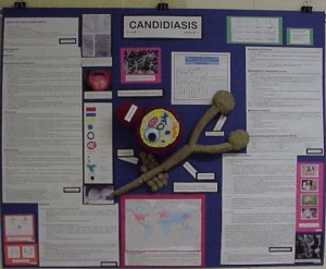
Comment: This poster has a very nice model showing both the whole organism and the organism's internal structures. The model is well labeled and visually pleasing. We particularly liked the fact that the organism was shown both in its individual and multi-cellular forms. The poster also has a nice legend to the left to help the reader identify components. Poorly labeled models are very hard for others less familiar with the organism to identify. There are also nice micrographs of the organism, and of a person with the disease. Notice the presence of photos on the right side of the poster of the many animals that can serve as hosts for this disease. All portions of the poster are nicely presented, look professional and the author of each section is easily identified.
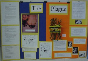
Comment: This poster also has a very nice well labeled model. Although there are many nice photos of the disease on this poster, a micrograph of the organism does not appear to be presented; a labeled micrograph of the causative microorganism is a must. All portions of the poster are nicely presented, look professional and the author of each section is easily identified. Notice the labels on each photograph referencing from where the photos were taken; this is essential. Also notice that each of the maps also references from where they came, and contains a legend that helps a viewer to read and understand the map. One problem is that no chart explains the demographics of this disease. If no chart could be found, the author using data obtained from their research should have created a demographic chart. Remember if you create a chart or map you must reference where the information was obtained to create your charts or maps.
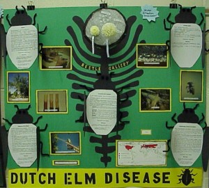
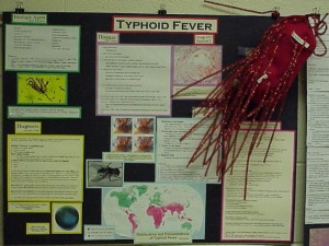
Comment: This is an unusually creative poster. Remember you should make people want to read your poster, this poster does that very well. However, as well as being creative your poster should be informative, accurate and adequately referenced. This poster has a very nice well labeled model, and many interesting photographs each referencing from where the photos were taken. Also notice that each of the maps also references from where they came, and contains a legend that helps a viewer read and understand the map. 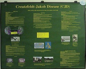
Comment: This is a very professionally presented poster. This poster looks great, and that is important, but remember, looking good does not substitute for content, accuracy and using proper scientific referencing, you need all of these things. Notice that this poster has a chart showing the demographics of the disease, as well as a map showing the parts of the world where this disease can be found. Another thing this poster did particularly well is to present material in a short bullet format, which is much easier for the reader.
Comment: This poster has all of the good qualities of the other posters. Notice they had to make their own map because they could not find one; however, if you make a map you should reference where the information used to create your maps were obtained. Also note the photo of a potential vector of the disease. Photos of all hosts, vectors, and reservoirs must be included on your poster.
Kiefer, Kate, Mike Palmquist, Luann Barnes, Marilyn Levine, & Don Zimmerman. (1999). Poster Sessions. Writing@CSU. Colorado State University. https://writing.colostate.edu/guides/guide.cfm?guideid=78